


You might have heard about a computer scientist who defined 10 usability principles, but maybe you’ve never been interested enough to put them into practice.
These aren’t just good practices—they’re essential principles for user experience (UX).
Users like to know what’s happening. Imagine being in an elevator that’s stopped, with no light, sound, or any sign of life.
Now, replace that example with your website or app—no feedback or sign of functionality.
Visibility of status is crucial. Give users an indication that your system is operating, processing, even if there are failures. This could be a progress bar, a “loading” message, or any sign of activity.
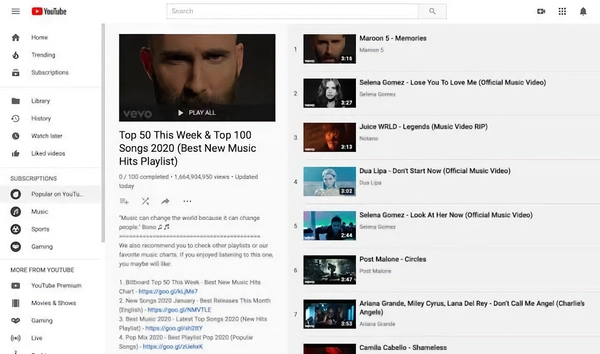
In this YouTube music playlist, we see what we’re currently listening to and which songs are coming up next. This is a sign of location, of life in our example.
We live in the real world and expect the systems we use to
reflect that.
This means using familiar language, icons, and interactions that make sense.
A classic example is the online shopping cart 🛒.
Everyone knows what a shopping cart is because they exist in the real world.

When someone sees the cart icon, they immediately understand it’s where selected items will be stored.
We all make mistakes and want to undo them without hassle.
A simple “back,” “undo,” or “cancel” button makes a huge difference.
When designing your interface, remember to give users tools to control their
experience and a way to reverse unwanted actions.
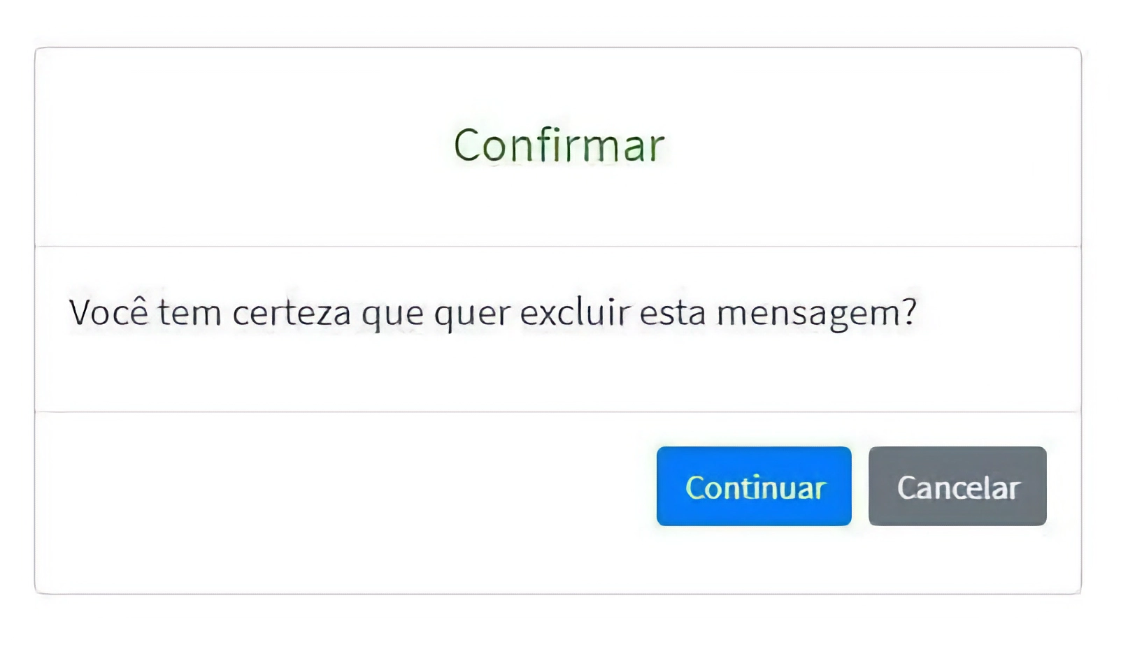
These little boxes that pop up when we make a mistake, asking if we really want to proceed.
When creating your website or app, think of consistency as a path to sanity. Keeping elements uniform and standardized prevents every page from becoming chaotic and disorganized.

Google is a great example of design consistency. You won’t see a neon purple blinking button in a Google service.
Prevent errors before they happen. For example, if a phone number field shouldn’t contain letters, the system should prevent users from typing letters there in the first place.
Be proactive, not reactive: anticipate user errors.
Users don’t want to memorize where every option is in the
system.
They want to click, see, and act.
Familiar design patterns, consistent information organization, and clear
visual cues make users’ lives easier and create a smoother experience.
Create a system that adapts to the user, not the other way
around.
Your system should serve both novices and experts. Allow shortcuts for those
who know them and simple options for those who prefer ease.
Avoid cluttering your interfaces with unnecessary elements. A clean, minimalist design improves user experience.
LESS IS MORE.
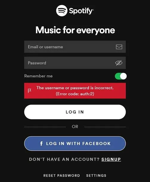
Provide clear warnings about where the error occurred and how to fix it. This helps users recover quickly from mistakes.
Although not everyone accesses documentation or help, they’re important. Provide a “DIY” section so users can resolve doubts independently.
It’s essential to design interfaces with the user in mind. It can’t just look pretty—it has to work well.

Keep following the blog for more updates and insights on the latest innovations in technology.